The Component Tree
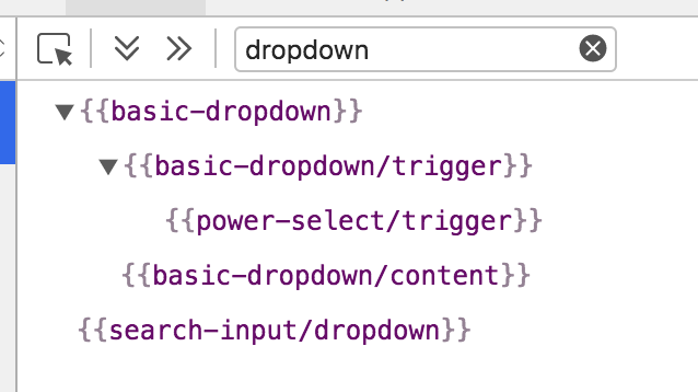
The Components tab displays a collapsible representation of the views and components that are currently being rendered. Selecting a component from the tree will open it in the Object Inspector.

Components will be displayed with curly braces. Views are grayed out and not selectable. Use the View Tree to get more information on Views that are being rendered.
Scrolling to a Component in the Browser
Clicking the 'eye' icon to the right of a component will scroll that component into view in the browser.
Expanding and Collapsing Components
Components can have their children hidden and shown by clicking the caret just to the left of the component.
The two icons to the left of the search field will expand or collapse all components.

Filtering Components
By typing in the search field you can limit the components that are shown in the tree.

Highlighting Templates
Hovering over the Component Tree
When you hover over the items in the Component Tree, the related component will be highlighted in your app. For every highlighted component, you can see the template name and its associated objects.

Hovering over the app
If you want to highlight a component directly within your app, click on the icon to the left of the search bar (this is the same behavior as the View Tree) As your mouse passes over it, the related component will be highlighted.

If you click on a highlighted template or component, the Inspector will select it. You can then click on the backing objects to send them to the object inspector.

Click on the X button to deselect a template.